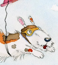
Completed this color rough, with a line down the middle for colored pencil line on one side and ink on the other. This is done on cold press watercolor paper. I prefer hot press. Cold press is too bumpy for me:)
I can't see it large enough to really see the difference between the ink or the coloured pencil line work. Which did you prefer in the end? Could you add a section zoomed in on for us to see perhaps?
I like cold press (or 'Not') paper to paint on, but not with too rough a surface. I think Fabriano does a paper that is somewhere between the two surfaces, but I forget what it is called as I couldn't get it in the UK. Hot press paper tends to be just a little too smooth for my liking, but it is good for scanning if you don't want the paper texture to show up! I quite like seeing paper textures in the scans though!
Keep sharing your lovely characters with us, it is always a pleasure to see what you have been working on.
Oh my goodness! I just found your blog and I am in love with your little characters!!! I can't wait to see your new website when it is finished so I can peruse your portfolio! I'll keep checking back. Great work!!
Bethany and Alicia, thank you! Feel like I was fighting with the cold press texture:) Good to know you still like it.
June, I'll look out for that paper. Fabriano's whites are really nice, wonder if they have a pad-hate stretching paper!! Leaning towards micron pen with colored pencil for his furriness;) Glad you're enjoying the characters!
Phyllis, thanks for stopping by and leaving such a sweet comment:) That old website...so slow going! Have someone doing it for me and both of us have kinda stalled on it. Hopefully working on it will pick back up-I need one!!
I adore children’s illustration and spend my time drawing and painting. I especially enjoy creating characters. After a bit of sketching they seem to take on a life of their own and are kind enough to let me get to know them.


6 comments:
Cold press is definitely more for painting than drawing. But again, your illustration is fantastic!
I love it Christine!! :o)
And I do love that we can see the texture of the cold press. Maybe it's not so fun the pen and ink with all those lumps for it does look fantastic!
I can't see it large enough to really see the difference between the ink or the coloured pencil line work.
Which did you prefer in the end?
Could you add a section zoomed in on for us to see perhaps?
I like cold press (or 'Not') paper to paint on, but not with too rough a surface. I think Fabriano does a paper that is somewhere between the two surfaces, but I forget what it is called as I couldn't get it in the UK.
Hot press paper tends to be just a little too smooth for my liking, but it is good for scanning if you don't want the paper texture to show up! I quite like seeing paper textures in the scans though!
Keep sharing your lovely characters with us, it is always a pleasure to see what you have been working on.
Oh my goodness! I just found your blog and I am in love with your little characters!!! I can't wait to see your new website when it is finished so I can peruse your portfolio! I'll keep checking back. Great work!!
Bethany and Alicia, thank you! Feel like I was fighting with the cold press texture:) Good to know you still like it.
June, I'll look out for that paper. Fabriano's whites are really nice, wonder if they have a pad-hate stretching paper!! Leaning towards micron pen with colored pencil for his furriness;) Glad you're enjoying the characters!
Phyllis, thanks for stopping by and leaving such a sweet comment:) That old website...so slow going! Have someone doing it for me and both of us have kinda stalled on it. Hopefully working on it will pick back up-I need one!!
I think the texture of this guy on the cold press is wonderful. Seriously. I think it works really well.
Post a Comment