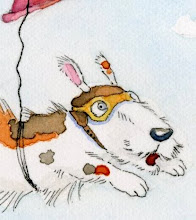
Here's a close-up of my color rough in the previous post. Does it make it easier to tell the character is done in ink on the right and colored pencil on the left? I think it may not, I need to keep practicing my linework. It may all just blend together...Other illustration was a fun exploration trying to figure out how I'm going to go about painting and inking the little guy.
I think I'm leaning towards the combo of colored pencil (for softness around the face) with micron pen and watercolor.


6 comments:
I agree with you... the micron pen makes the image stronger, the watercolor gives it an overall nice color but the addition of the colored pencil adds another layer of texture, adding variety to the color scheme and a little depth. I am just in love with this little guy! I hope you are making this into a book for sale!!!
love it! very appealing character :D
Glad you like him:) He's for my thesis but will (eventually!) be submitted to publishers. Fingers crossed.
He's the most adorable character with such a lovable personality. I'm sure it will be an instant hit with the publishers and kids.
Personally, I really like the micron/watercolor image the best. You have a great way with the line, it's not too dark, so it doesn't distract. But the micron makes it subtly pop. For a softer look, I think the combo with micron,colored pencil and watercolor work works too.
He's so adorable. I love his glasses!
It is still hard for me to see the split image differences with only a small image view, but from what I can see of the other tests, I agree that Micron and watercolour look to be working great, and I think that adding a little coloured pencil will probably give that final touch of perfection!
Thank you for sharing your experiment in media with us.
This little guy is going to have so much fun in your books :o)
Post a Comment