

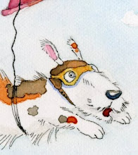
-the uncropped version....How fun would it be to design book covers? Here's a cover idea I have for my current project. I like it but...I am so disappointed when I go to print work out. I have a good printer, an Epson RX620 but it's never enough like the original. I am trying to paint stronger watercolors because I tend to go to weak. This helps but I wonder how to people get their work to look right for printing in books? Or reproducing anything, especially for sale?


6 comments:
I really like this cover. The colors, the detail, the texture all of it! I use an Epson Photo Stylus 1400 that was on sale a while ago. It uses Claria inks by Epson, prints up to 13 x 19 inch sheets and by using Epson Premium paper I get really good quality and the colors are amazing. One just has to remember to use the correct side of the paper (lol)
Your work is beautiful.
I use a Canon with pigment inks and it prints incredibly well. Very bright and clean. When I work traditionally I photograph my work out side in natural light with a 10mpx Canon camera instead of scanning for a very clean, true color image.
Thank you Ginger:)
And thanks for the printer info. I would be great to be able to reproduce work at a great quality.
Christine, I completely understand your frustration (and I'm secretly glad that another artist shared this side of the work). I have yet to find a way to have my scanned/printed art come out even remotely close to all the detail I put into my colored pencil drawings. It is agonizing! I bought a new scanner, just bought a new printer...good luck to you in figuring out how to best show your work. It IS lovely, by the way!
Hi, I listed your blog on my blog as one of my favorites. There is an award if you are interested :)
Watercolours are tricky to catch well into a digital image because of their transparent qualities.
Start by checking that your computer monitor is calibrated so that when you print, it looks like what you see on the screen?
Make sure you have selected the right printer settings for the paper too. And use good inks - pigment based rather than cheap dye based if you want archive quality.
You need a good scanner to capture the digital file, and then you may have to take the image into some editing software such as Photoshop, or something similar that allows you to make adjustments.
Then you should experiment with settings to adjust the curves (or levels if you don't have curves)to bring the colour up a little stronger until what you see on your screen is almost the same as the original.
Changing the gamma setting can also help. There are lots of helpful tutorials on the web.
I am sure with practise, you will find a way to print your work close to the original colours, though it will never be a perfect match as printer inks are working with fewer colours than in our traditional medium.
Good luck.
Post a Comment